Implementing Atomic Design in a React Native E-Commerce Application
Building a Scalable Component Library from the Ground Up
A deep dive into architecting 390+ components using Brad Frost's Atomic Design methodology

The Problem I Set Out to Solve
I owned the UI foundation of a React Native framework that a whole catalogue of e-commerce apps is built on. That leverage cuts both ways: a good pattern reaches every app instantly, and so does every inconsistency. By the time I stepped back to look at the whole system, the UI had drifted into a jungle — three different buttons, five kinds of product card, spacing that was subtly off from one screen to the next. Nothing was broken, exactly, but the cost was compounding.
Every new feature began with a decision no one should have to make — which button do I copy? — and every small design change turned into a hunt for the same edit across dozens of files. Multiply that across a codebase meant to scale to many apps and the trajectory was obvious: slower delivery, thinner consistency, and a growing tax on everyone who touched the UI. I made the call to stop paying it and rebuild the foundation on Atomic Design.
Why Atomic Design
I weighed the usual options. A flat components/ folder of shared widgets was where we already were — it doesn't survive past a few dozen components. An off-the-shelf UI kit would have fought our theming needs and locked us into someone else's opinions. What I wanted was a system with a clear mental model, room to grow, and a vocabulary the whole team could share. Atomic Design gave me all three.
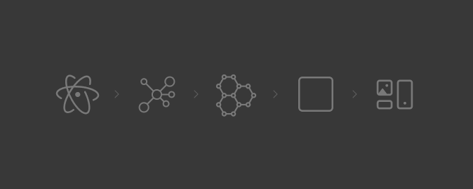
The model is easiest to picture as LEGO: start with tiny, single-purpose pieces, combine them into larger meaningful ones, and keep assembling upward until you have full screens. Brad Frost's five levels — atoms → molecules → organisms → templates → pages — gave every component an unambiguous place to live, and gave the team a shared language for where new work belonged.
Structure That Enforces Itself
I mapped the five levels straight onto the folder structure, so the architecture wasn't a diagram in a wiki — it was the directory tree people worked in every day:
atoms/
molecules/
organisms/
templates/
pages/
That one decision did a lot of quiet work. Every component had an obvious home, nothing drifted into a catch-all folder, and "where does this go?" stopped being a judgment call — the level a piece belonged to answered it. Structure that enforces itself needs no policing.
Atoms — The Contracts Everything Depends On
Atoms are the framework's alphabet — Text, Image, Layout, Touchable. They're small and unglamorous, and they're also the contracts every higher layer depends on, so getting them right was non-negotiable. Get an atom wrong and the mistake propagates to every screen; get it right and consistency becomes the default instead of something people have to remember.
KitText is the clearest example. Rather than let raw text components scatter font sizes and colours across the app, I funneled all of it through one component that owned typography, theme colours, accessibility, and even HTML rendering. Because every string in every app renders through KitText, correct typography and accessible defaults ship for free — enforced by the architecture, not by code review.
Molecules — Where Reuse Starts to Pay Off
Molecules combine atoms into the pieces people actually reach for while building a screen. The Button was the highest-leverage one: a single component covering primary, destructive, and outline variants, an icon on either side, loading and disabled states, all theme-aware. It quietly retired every stray Button2.js and GreenButton.js in the codebase — and, more usefully, made those files impossible to justify creating again.
The Floating Input followed the same principle: solve the "label floats up on focus" interaction once, correctly, and every form across every app inherits it. The pattern that mattered wasn't any single molecule — it was that the right thing to build with had become the easy thing to reach for.
Organisms — Real Sections of a Screen
Organisms are where it starts to feel like a real app: product cards, product grids, the search bar, bottom sheets, the reviews section — each a self-contained region assembled from molecules and atoms.
The Product Card shows the payoff. Instead of a new component for every context, one card supports several layout variations on top of a shared structure — so a card in a grid and a card in a carousel are the same component wearing different clothes. One place to fix a bug, one place to evolve the design.
Templates — The Blueprints
Templates define structure without committing to real content. The Filter & Sort template, for example, arranges a header, an accordion of filters, the sort options, and the clear/apply actions — but it's a blueprint, not a finished screen. Separating layout from data this way let a designer reason about structure while an engineer wired in data, without the two stepping on each other.
Pages — Where It All Comes Together
Pages are templates filled with real data. The Product Detail Page drops an ActionBar, an image carousel, the product info block, a variation selector, reviews, and an Add to Cart button into place — every one already built, themed, and tested lower down the ladder. By the time you're assembling a page, you're composing proven pieces, which is exactly where the speed comes from.
Theme-First, Because Every App Looks Different
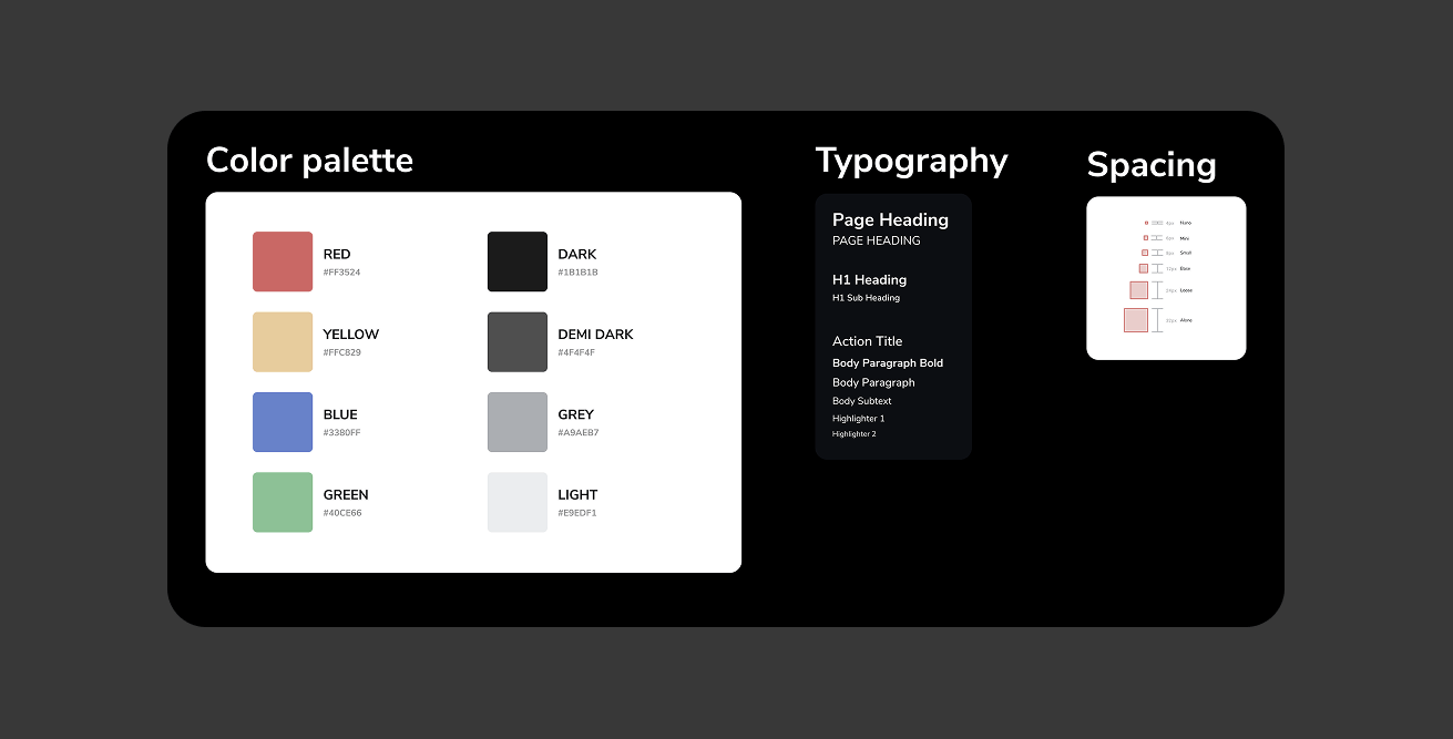
One decision shaped everything above it: theming couldn't be an afterthought. In a framework where every app carries its own brand, a component that hard-codes a colour is a component that breaks the moment it's reused. So colour, spacing, and typography lived in a theme from day one, and every atom read from it rather than from literals. Retrofitting that later would have meant reopening all 390+ components; building it in from the start turned re-skinning an entire app into a change to a single theme object.
The Impact
The architecture is tidy on paper, but what justified the investment showed up in the numbers — and in how the team worked every day.
Consistency by default
Because every screen flows up from the same atoms and the same theme, the UI is coherent without anyone policing it. Designers noticed first; engineers stopped eyeballing spacing.
Features composed, not built from scratch
Most new work stopped being greenfield and became a matter of assembling existing pieces. A feature that once meant a file of custom layout code now reads like this:
<Layout>
  <ActionBar title="New Feature" />
  <ProductGrid products={data} />
  <Button>Continue</Button>
</Layout>
Fix once, fixed everywhere
Bugs and design changes land at the source. Correcting a colour in KitText propagates across 200+ screens without opening any of them — the difference between an afternoon and a five-minute change.
Onboarding measured in hours, not weeks
New engineers were productive on day one, because the folder names are the mental model. There was little to explain and almost nothing to memorise.
390+ components, ~95% reused
The system grew to 390+ components across 24,000+ lines, with roughly 95% of the UI reused rather than duplicated — the clearest signal the foundation was doing its job.
What I'd Tell Another Team
The most important call is counter-intuitive: don't start with pages. Start with the small pieces the pages are made of. It feels slower for the first week and then it compounds — once solid atoms and molecules exist, the screens practically build themselves, and every hour spent on the foundation pays back many times over.
A few principles kept the system healthy as it scaled:
- Keep atoms small and genuinely single-purpose — an atom that does two things soon becomes two problems.
- Resist over-abstraction; add flexibility when a second real use case demands it, not in anticipation of one.
- Design components to compose, not to configure through an ever-growing list of props.
- Give the system a Playground screen — one place to preview and test every component in isolation, which doubled as living documentation for the team.
Final Thoughts
This UIKit turned a drifting product UI into a clean, scalable foundation that carries an entire framework of apps — and it changed how the team ships, from writing screens to composing them. The best measure of a design system isn't how elegant its diagram looks; it's how much faster everyone around it moves. By that measure, it was worth every minute.
Resources
Have you implemented Atomic Design in your projects? What challenges did you face? I'd love to hear your experiences.